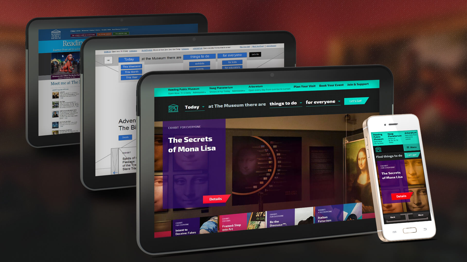
Case Study: Reading Public Museum
The Challenge
When we first spoke to Reading Public Museum, its website might as well have been an artifact in the museum. The museum recognized that an overhaul of its online presence was the first step to better serving its customers (and attracting new ones), but they needed a partner to help them get there.
Our challenge was not to simply redesign the website, but to position the museum as a regional destination—to elevate its services and programs as a source of entertainment (and education). The website happened to be the primary vehicle to do that.
We wanted to create an online experience that made the discovery of exhibits and events exciting. It needed to be responsive across all devices for users and easy to content manage for the staff. From day one, we knew the information architecture was going to be a key part of that experience. It was our mission to make every bit of information on the website as easy to access as possible (and generate a sense of FOMO along the way). We wanted visitors to feel that the museum was experience they just couldn’t pass up from the moment they landed on the homepage.
The Approach
We didn’t waste time trying to create a website that looked like that of every other museum. Our mission was to create a website that would remind people of all the things they were missing out on by not going to the Reading Public Museum. Our first step was also a strategic branding decision: shorten the name to simply “RPM” to create a more approachable and casual feel.
Discovery: Analyzing the Artifacts
RPM isn’t competing with other museums; it’s competing with iPads, television, social media, and local entertainment venues. We researched platforms like Hulu, Netflix, and HBO GO to understand how their content is delivered and how users consume and interact with that content. We also looked at Fandango for inspiration on how to display event or show-driven information, a core part of the museum’s online experience.

From there, we created lightweight personas for each primary audience: kids, educators, and groups. We outlined their interests and behaviors to understand what these audiences are looking for when it comes to entertainment. For example, Erin, a mother of two children under the age of three, might be looking to entertain her kids on a rainy day, while Mrs. Shay, a teacher at the local elementary school, might be looking for ways to marry her curriculum to tactile and notable experiences.
Information Architecture: Curating A Navigation
The personas directly shaped the information architecture of the website. For each visitor type, we determined what he or she wants to know about RPM—the who, what, where and when. The answer to each of these questions was translated into a brand statement: “Today at the museum there are exhibits for everyone.” And this brand statement become the core of the website’s utility: the navigation.

The navigation leverages a series of drop-down menus that give each visitor the ability to create his or her own Reading Public Museum experience by defining the when, what and who (e.g., “Today at the museum there are exhibits for kids.”). This interactive navigation is a tangible extension of the museum’s mission “to educate, enlighten and engage current and future generations...” and acts as a brand statement across the entire online experience. A user can also view museum and arboretum hours, and planetarium show times quickly and easily on multiple devices.
Design & Development: A Customized Display

From brainstorming sessions to ongoing design reviews, we worked side by side with RPM to ensure the vision was carefully executed at every stage of the project.

Before our team even opened a Photoshop file, we curated visual mood boards and style frames that translated our brainstorming sessions into final art directions. This set the tone for the overall design and user experience of the site, which was a stark contrast to look of that of other museums.
We also built a ground-up content management system that organizes and delivers information about attractions, events and exhibits to the right audience at the right time on any device. Now, visitors always have access to accurate and timely information with minimal human effort.
The Impact
Prior to the launch of the new website, readingpublicmuseum.org had low daily visits and of this number, mobile traffic was barely quantifiable; only 13% of visitors were coming from iOS devices and Android devices weren’t even in the top three sources.The average daily traffic has grown over 400%! iOS devices account for 40% of this traffic and 24% from Android.
The museum also saw a surge in annual attendance by more than 22,000 visitors. The accessibility and usability of the new website has created a seamless experience for RPM and the thousands of people who visit the museum each year, a display-worthy exhibit of discovery and design.


